


Hello makers,
I hope you're enjoying this Serial Maker newsletter! Join me and other Serial Makers on Discord. Check out the past editions if you missed them. And if you know someone who might benefit from this newsletter, please forward this email to a friend 😀
Living on opposite sides of the design coin are two distinct principles. On one side lives gestalt, where the discreet components of visual design influence the perception of the viewer. On the other side lives metaphor, where our imaginations take hold, and meaning is applied to reality.
Leverage these opposing sides, and master your visual creations.
Let's release your inner design nerd.
Gestalt 🌑
‟The whole is other than the sum of the parts.”
—Kurt Koffka
When we observe something, we perceive it as a whole, well before we are able to distinguish its parts. This is the fundamental theory of gestalt. There are several principles commonly associated with gestalt theory. Seeing their usage in logo design will help to understand the concepts.
Similarity: we group like things together. The feathers of the NBC peacock logo are all similar shapes, and our mind sees them as one.
Continuation: the eye naturally follows a line. Observe the lines running through the Coca-Cola logo.
Closure: our brains fill in missing parts. We see a panda, instead of black shapes in the WWF logo.
Proximity: we group close things together. We see letters, not broken lines in the 8-bar IBM logo.
Figure/Ground: we isolate foreground objects from a background. Everyone sees the mountain in the Toblerone logo. But do you see the bear?
Symmetry and order: our brain attempts to simplify ambiguous shapes. The Roxy logo is the Quiksilver logo, tilted and reflected to make a heart.


There are other principles, but these cover a lot of ground. In a nutshell, gestalt attempts to understand the psychology behind how our mind interprets pure design objects: shapes, colors, direction.
Metaphor 🌕
A successful visual metaphor should cause the viewer to want to look again. There is something more meaningful than what first may appear. Often times one visual element is compared to another visual element that belongs to a different category altogether. You've likely seen this used in advertising. Check out this board of visual metaphors for some excellent examples.
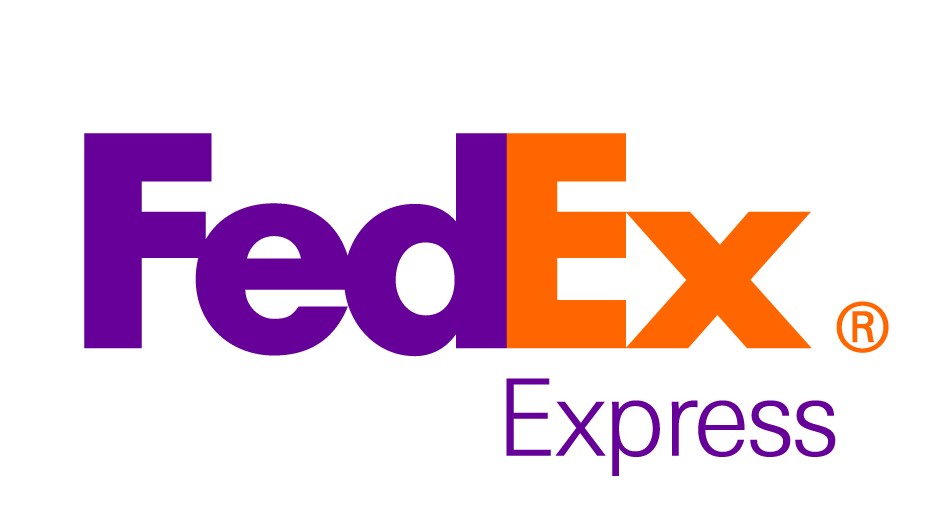
Think of a Jaguar, as the visual representation of a car company, implying speed and prowess. The negative space between the "E" and the "x" in the FedEx logo forms an arrow, a fitting metaphor for a delivery company.
But metaphor goes beyond design. In the film Memento, everything in a flashback (moving forward in time) is shot in black-and-white, while the present (going backward through time) is shot in full color. These are two separate stories, woven together in the film. When they meet, the black-and-white slowly changes to color, not unlike watching a Polaroid film develop. In doing so, the director Christopher Nolan provides further meaning to the viewer.
Putting it together 🌓
When making your next visual creation, pay attention to both the gestalt and the metaphor. Keep in mind the relationship between the parts of your vision, and remember that everything has meaning.
Keep making, and thanks for reading! 🙌
Hit reply to tell me what you're making. I'm looking for anyone interested in talking about their own side-projects and maker journey, so speak up if you'd like to appear in Serial Maker. I'd also love to know what you thought of this issue, and what you want to hear about in the future. And don't forget to continue the conversation on Discord!
Until next week,
Craig